Helping first-time plant owners grow with confidence.
GREEN THUMB
ROLE
End-to-end design
TIMELINE
4 weeks
FOCUS
Research, strategy, UX/UI, prototyping, usability testing
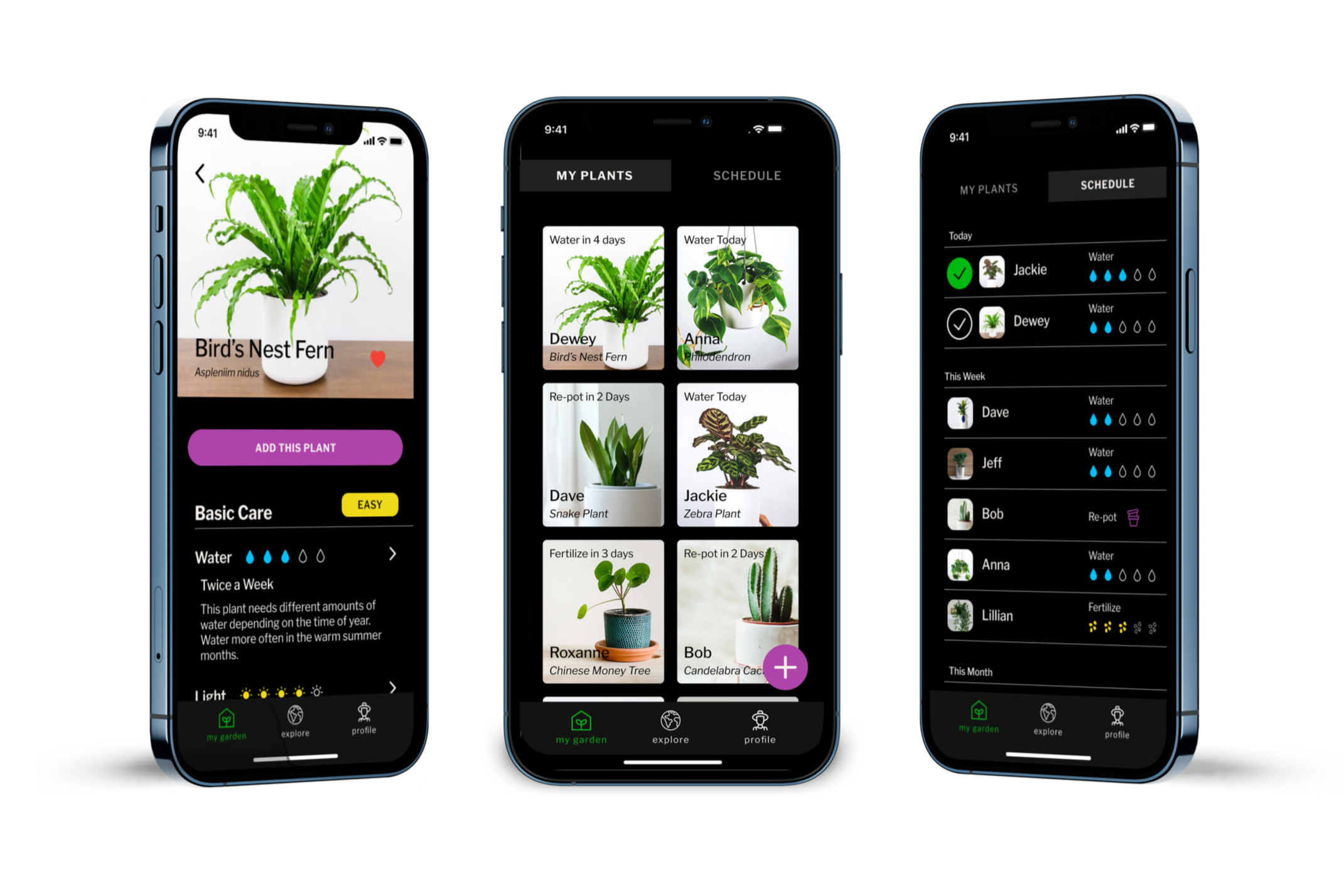
Green Thumb is a mobile plant-care companion that turns scattered advice and generic reminders into a practical routine for the plants people own.
THE CHALLENGE
New plant owners could search Google, watch YouTube videos, ask friends, or talk to a nursery employee. The problem was not access to information. It was knowing which advice applied to their specific plant, their home, and the decision in front of them.
Information was everywhere. Confidence was not.
Existing tools split the experience apart. Plant databases helped people identify what they owned. Reminder apps told them when to water. Content feeds offered inspiration and advice. None connected a plant’s identity, care needs, and next action into one clear experience.
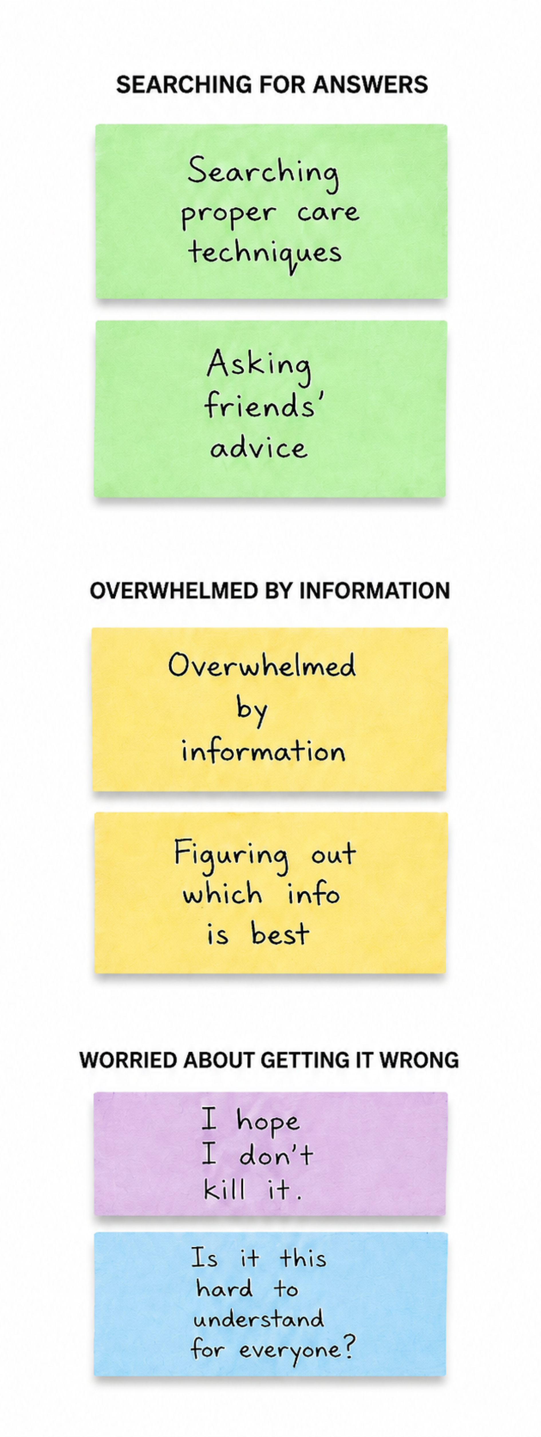
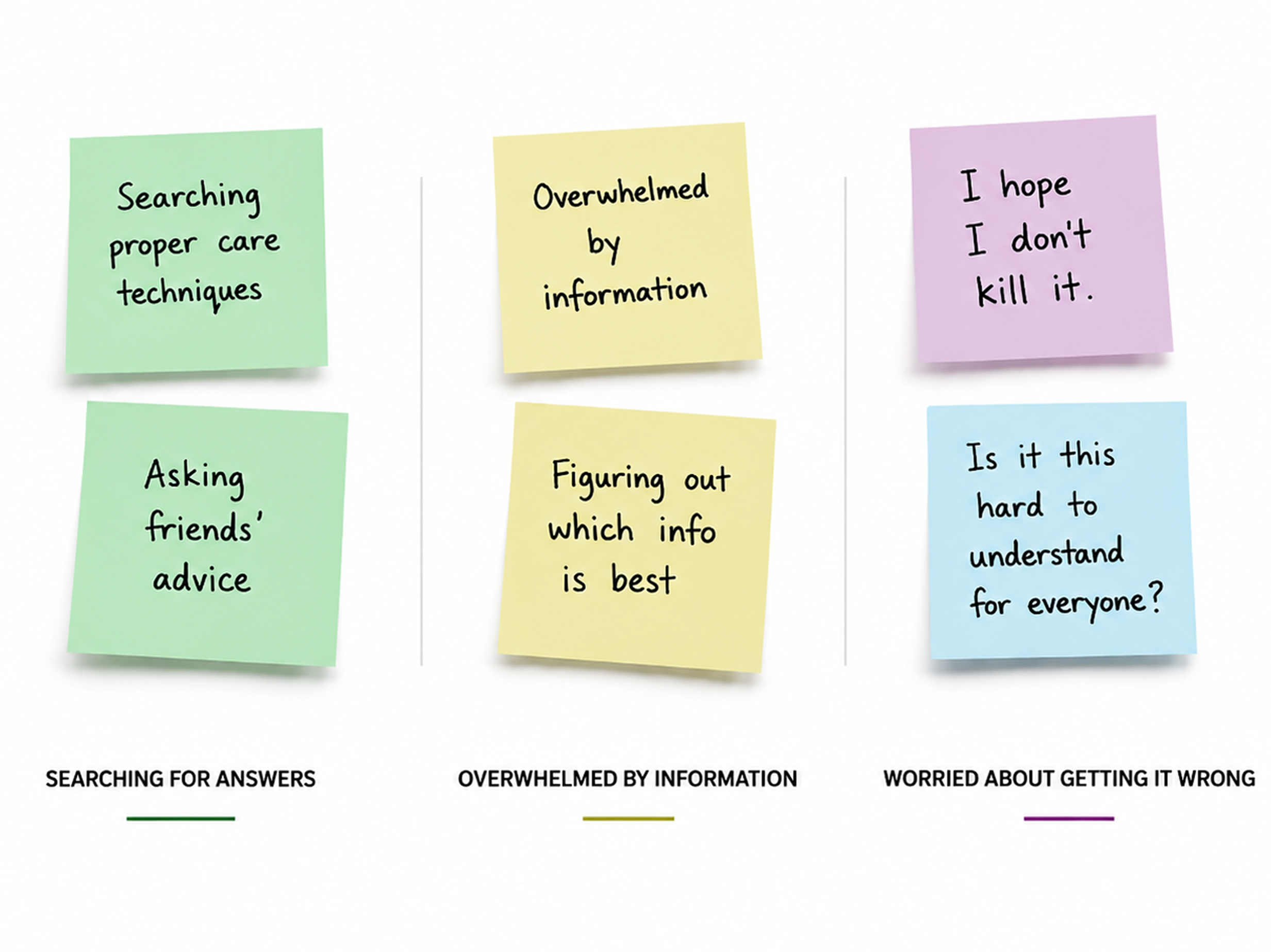
How might we help first-time plant owners replace uncertainty with confident daily care?
THE QUESTION
WHAT CHANGED MY THINKING
People didn’t need more information. They needed help using it.
I began by treating Green Thumb as an information problem. I assumed a richer plant library and more educational content would help new owners feel prepared. Research revealed something more useful: people were already looking for answers. They needed help knowing what applied to their plant and what to do next.
THREE INSIGHTS THAT CHANGED THE PRODUCT
01
Plants are emotional purchases.
Participants were drawn to plants for how they made a space feel, not because they wanted to master plant care. The product needed to preserve that sense of ownership and discovery while making care feel approachable.
02
Questions were specific and situational.
People were not looking to become plant experts before buying their first plant. They wanted answers when something felt wrong, when they were unsure whether to water, or when they needed to understand what their plant required next.
03
Generic reminders weren’t enough.
A reminder to water a plant creates another question: does it actually need water right now? Care prompts needed context, not just timing.
Build the experience around the collection, not the content.
THE STRATEGY
The product needed one reliable source of truth: the plants a person actually owns. Instead of opening into a broad content library or exploration feed, Green Thumb centers on a personal garden. Every plant in that garden carries the context needed to guide care: what it is, what the owner calls it, what it needs, and what action is coming next.
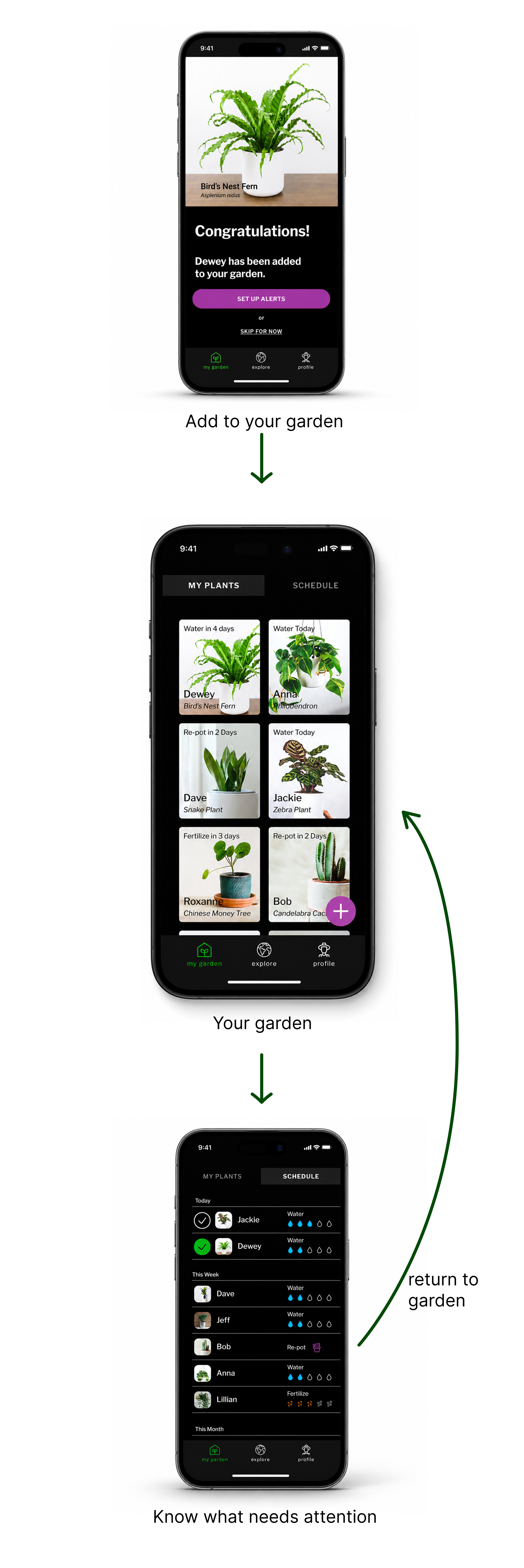
THE CORE LOOP
The MVP had one job:
make the care loop reliable.
The MVP focused on helping users complete this loop before expanding it. Community features, care journals, progress tracking, and broad educational content could add value over time, but none belonged in the critical path of helping someone care for their next plant.
KEY DECISION 01
Make getting started possible without perfect information.
A beginner may not know what kind of plant they own. Requiring a confirmed identification before letting them add it would create friction at the exact moment the product should feel most welcoming.
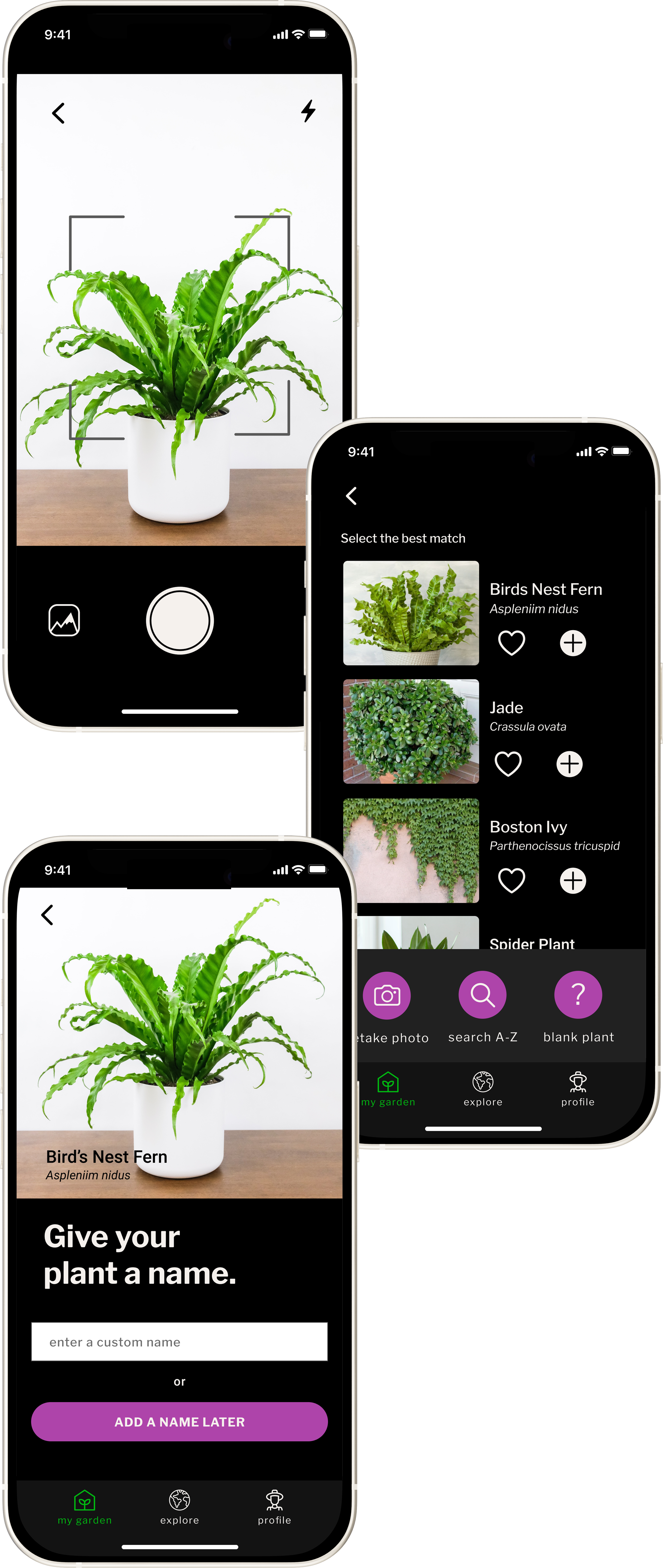
THE ADD-A-PLANT FLOW
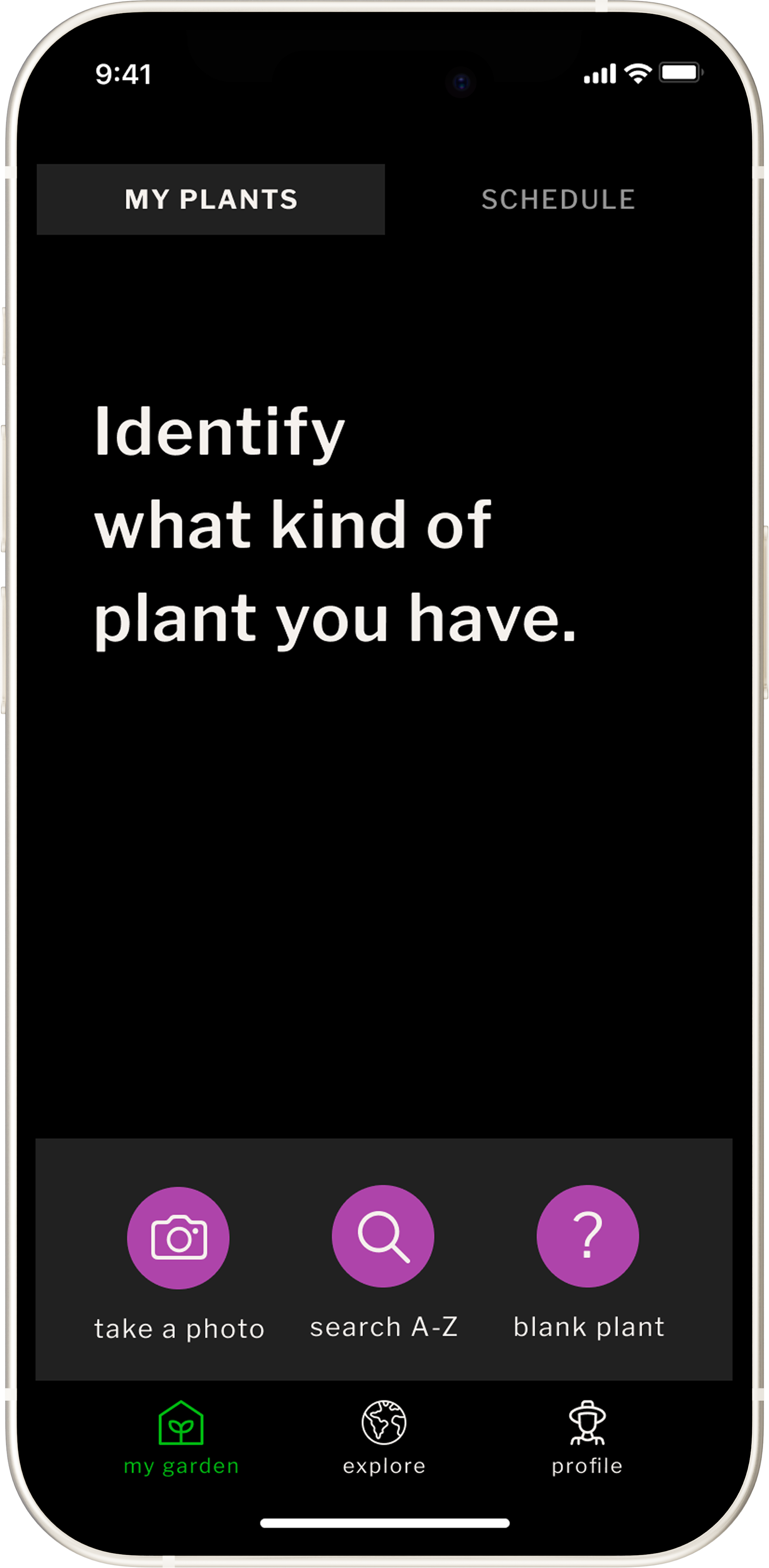
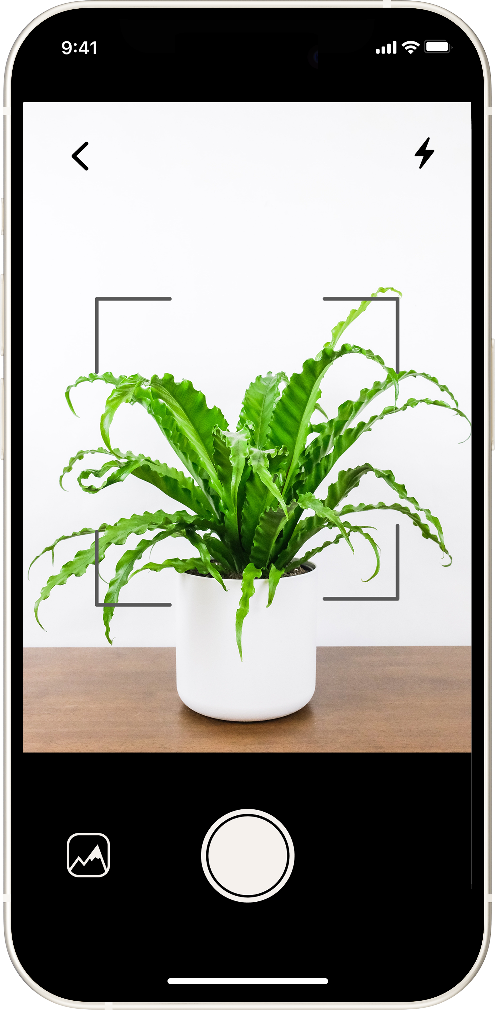
01 / START WITH WHAT YOU KNOW
A photo, library search, or blank entry lets users begin from the level of certainty they actually have.
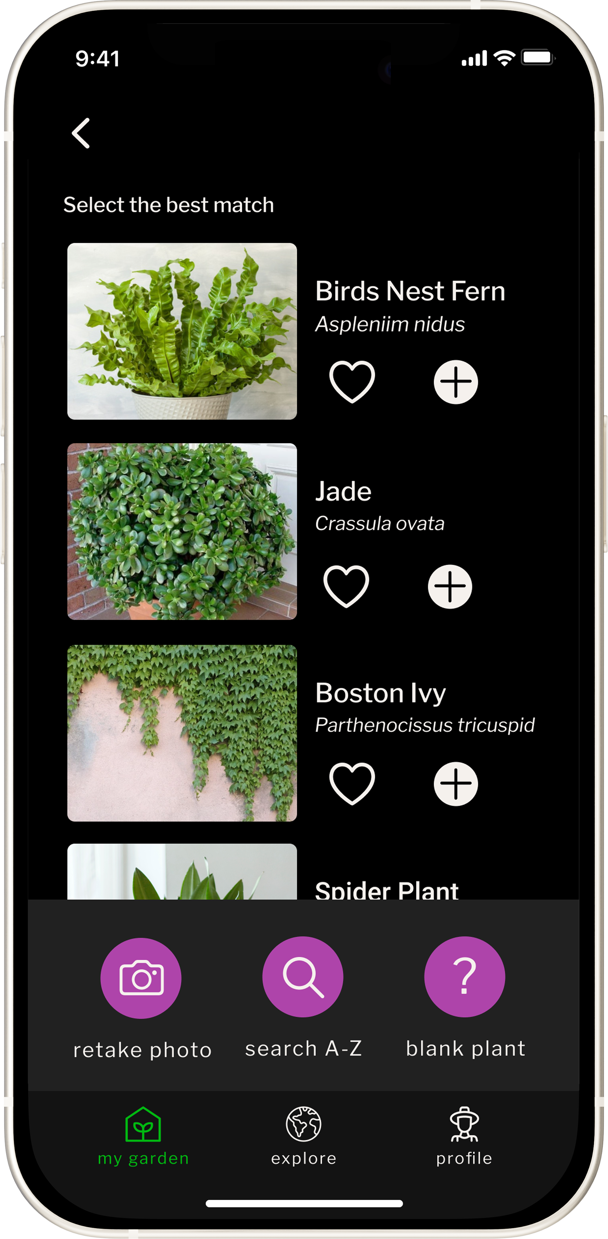
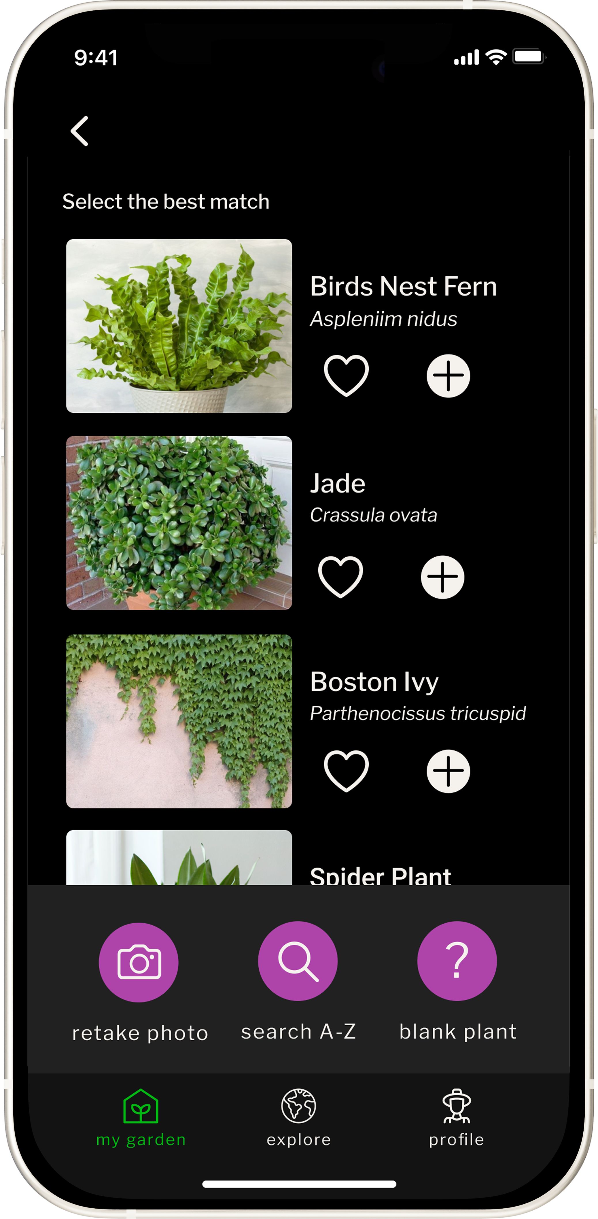
02 / CONFIRM A BEST MATCH
A best-match list narrows uncertainty without trapping someone in an incorrect answer.
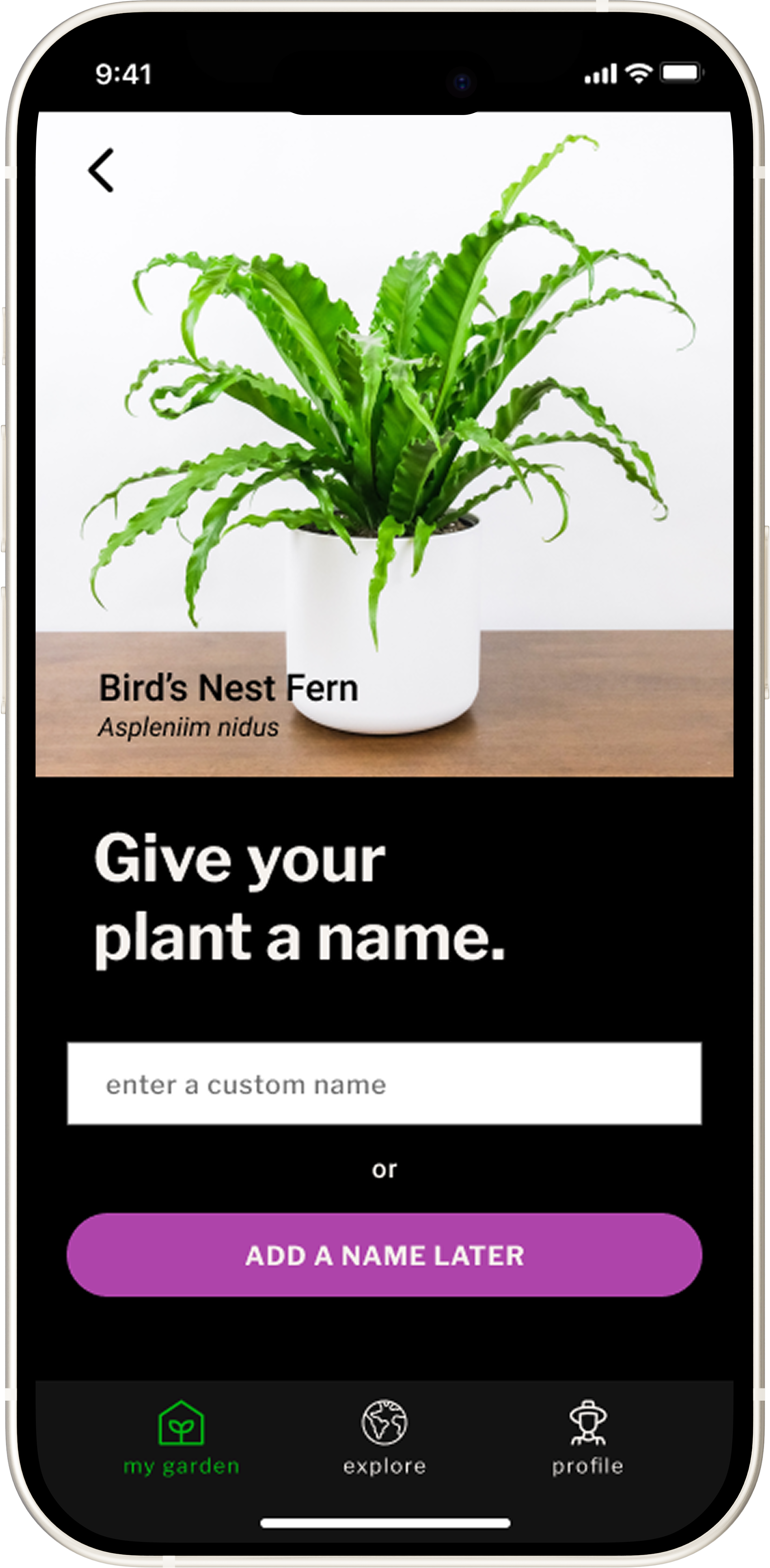
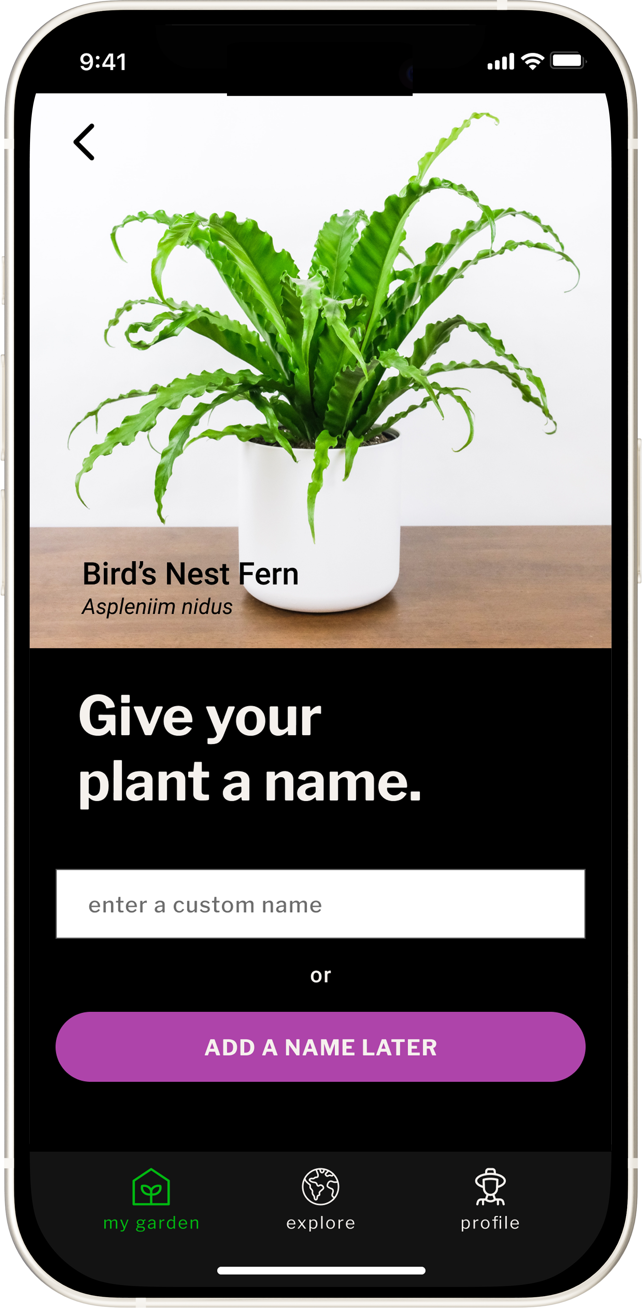
03 / MAKE IT PERSONAL
Users can name the plant now or later before it becomes part of their garden.
KEY DECISION 02
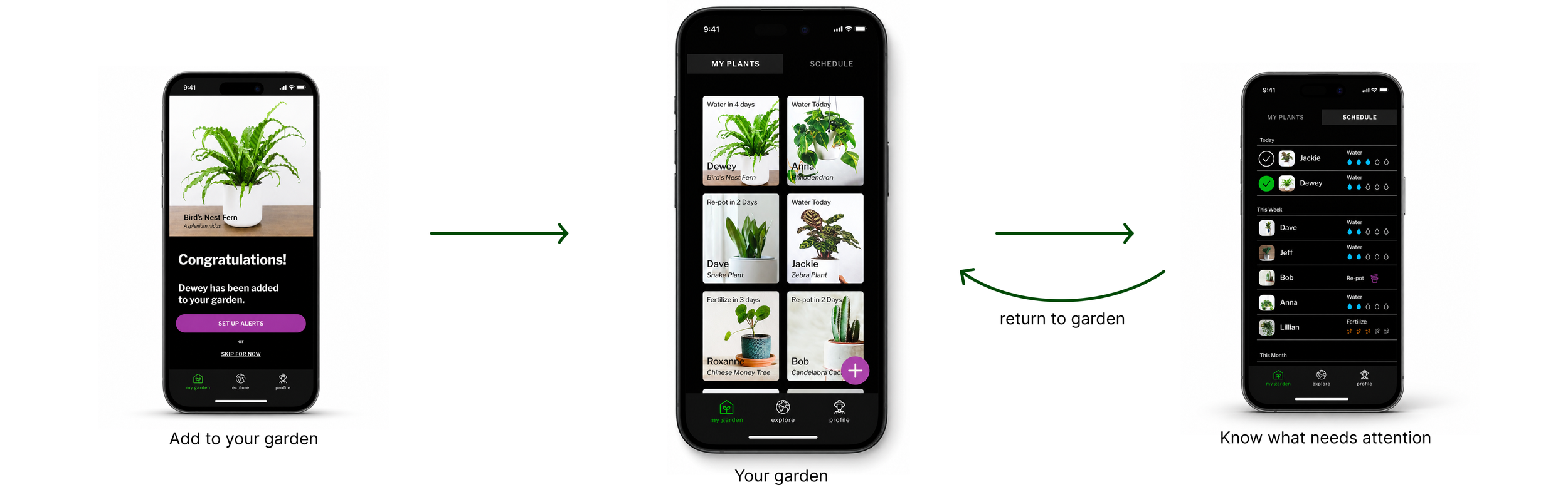
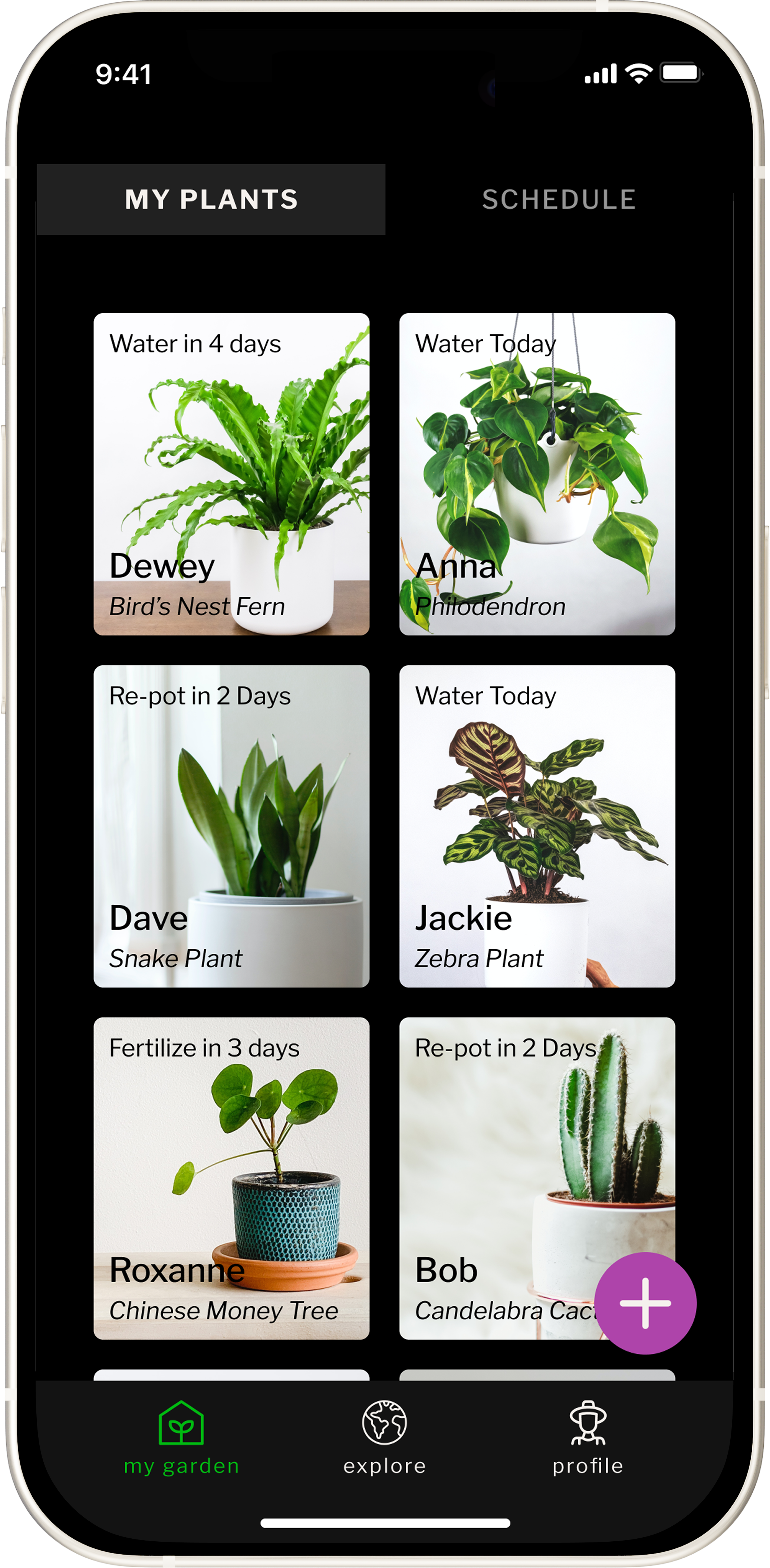
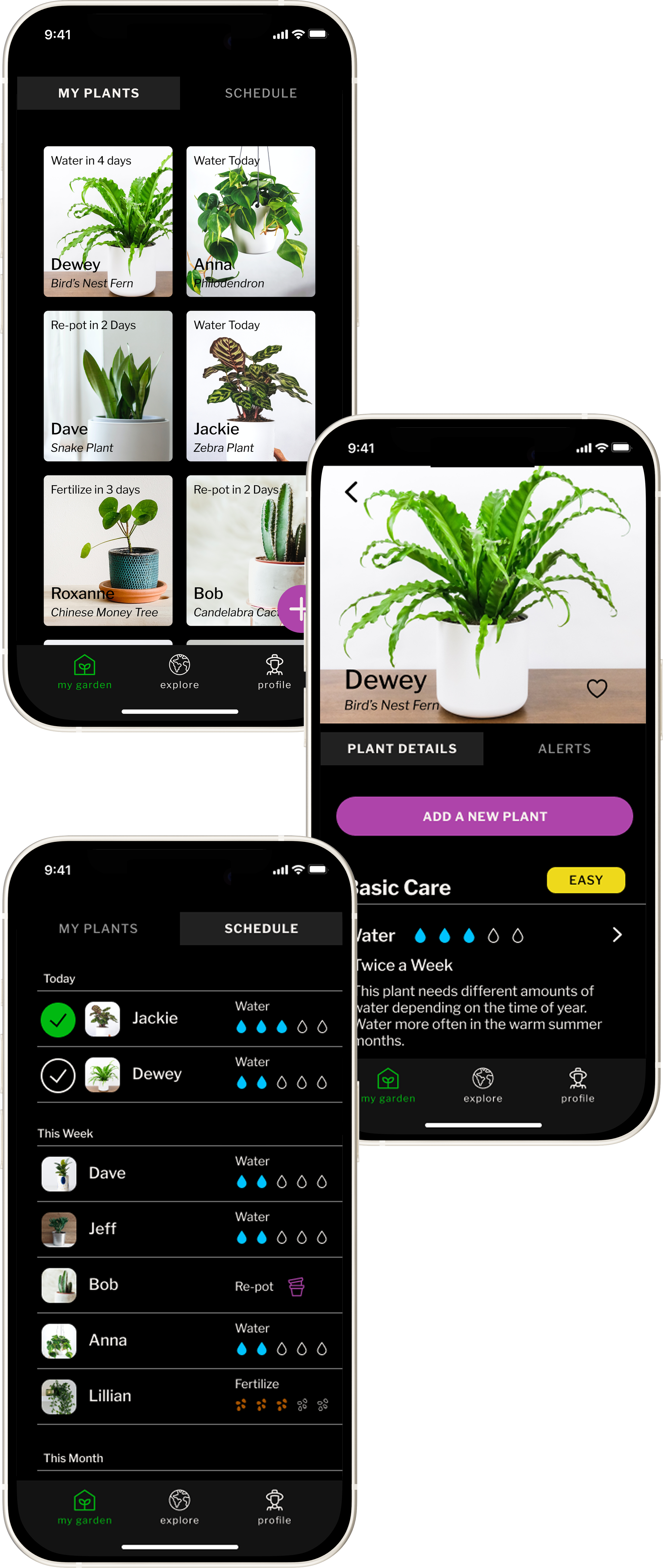
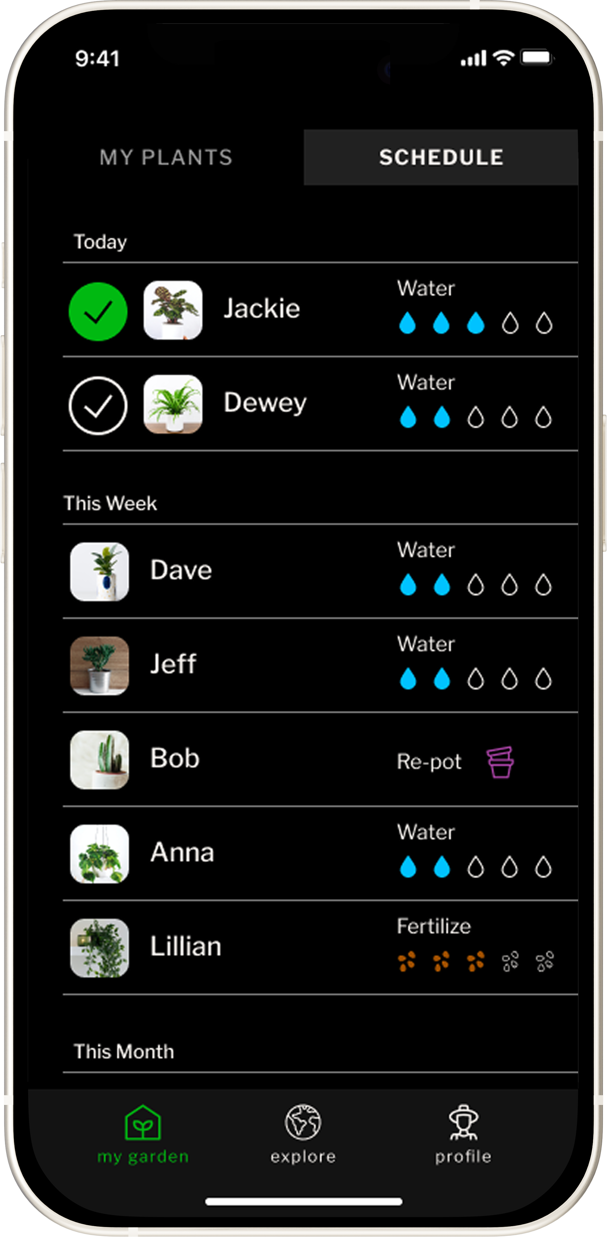
The core care experience had to answer one daily question: what needs my attention now? The garden view keeps ownership visible, while the schedule gathers plant-specific tasks into a clear plan for today, this week, and this month.
Turn a plant collection into an actionable care plan.
THE GARDEN BECOMES THE PLAN
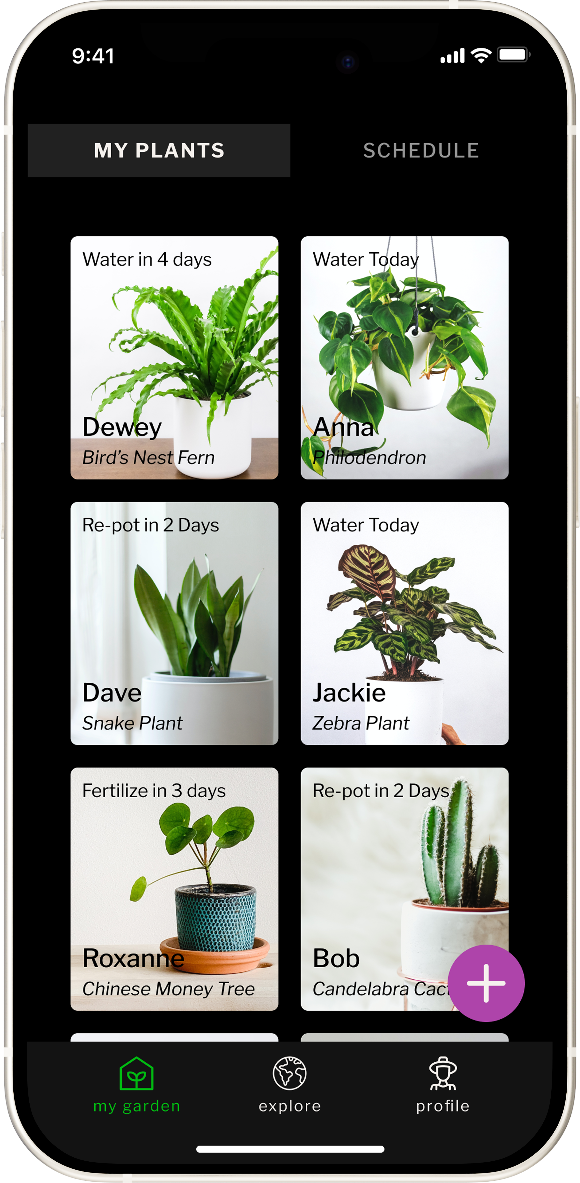
01 / OWN YOUR GARDEN
The garden keeps each plant visible as something the user owns, knows, and can return to.
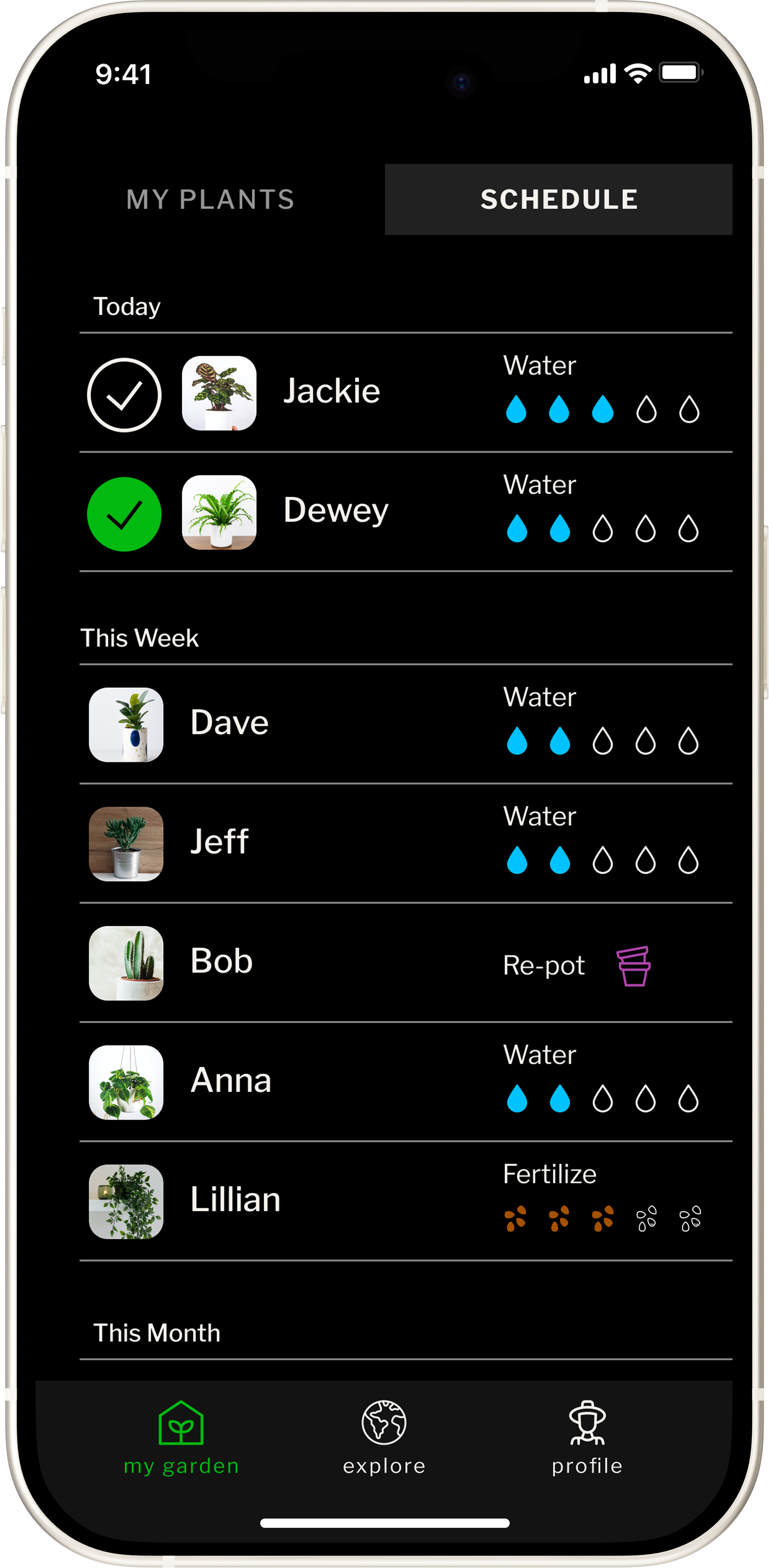
02 / KNOW WHAT NEEDS ATTENTION
The schedule turns plant-specific needs into a clear plan for today, this week, and this month.
KEY DECISION 03
Make guidance useful before making it comprehensive.
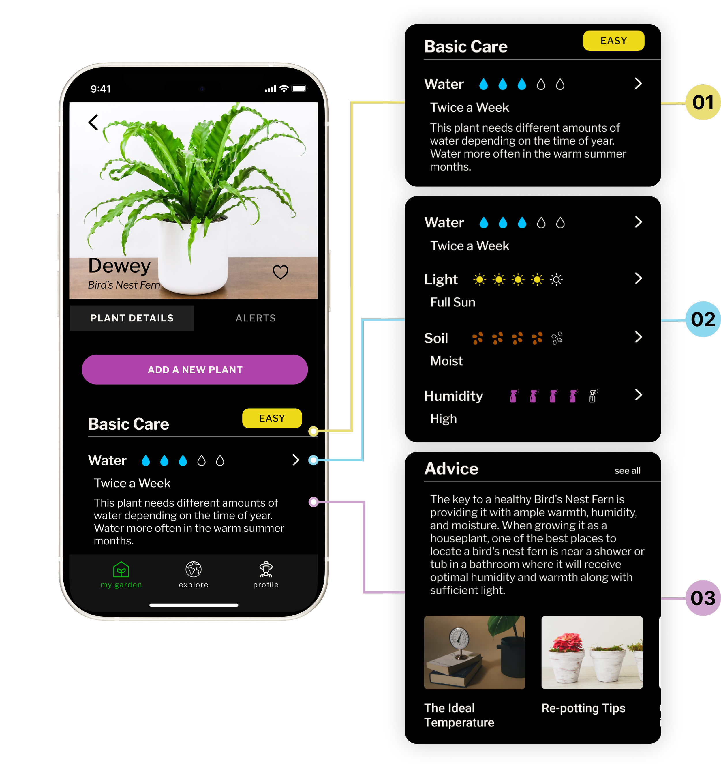
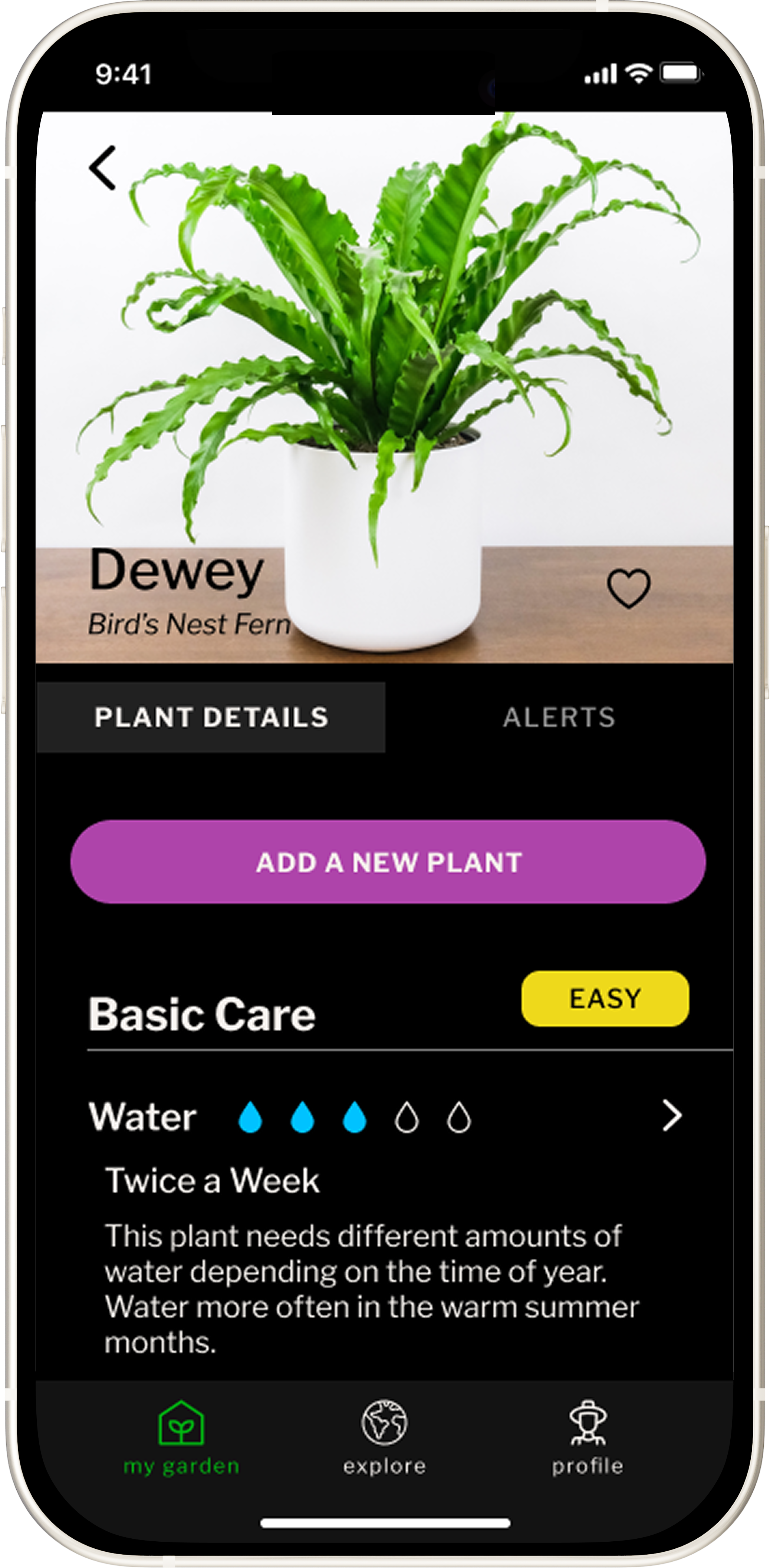
Plant care can become overwhelming quickly. The experience needed to answer the immediate question first, then reveal more detail only when someone needed it. Green Thumb uses clear care categories like water, light, humidity, and repotting to make guidance practical instead of encyclopedic.
Make guidance useful before making it comprehensive.
Plant care can become overwhelming quickly. The experience needed to answer the immediate question first, then reveal more detail only when someone needed it. Green Thumb uses clear care categories like water, light, humidity, and repotting to make guidance practical instead of encyclopedic.
GUIDANCE IN LAYERS
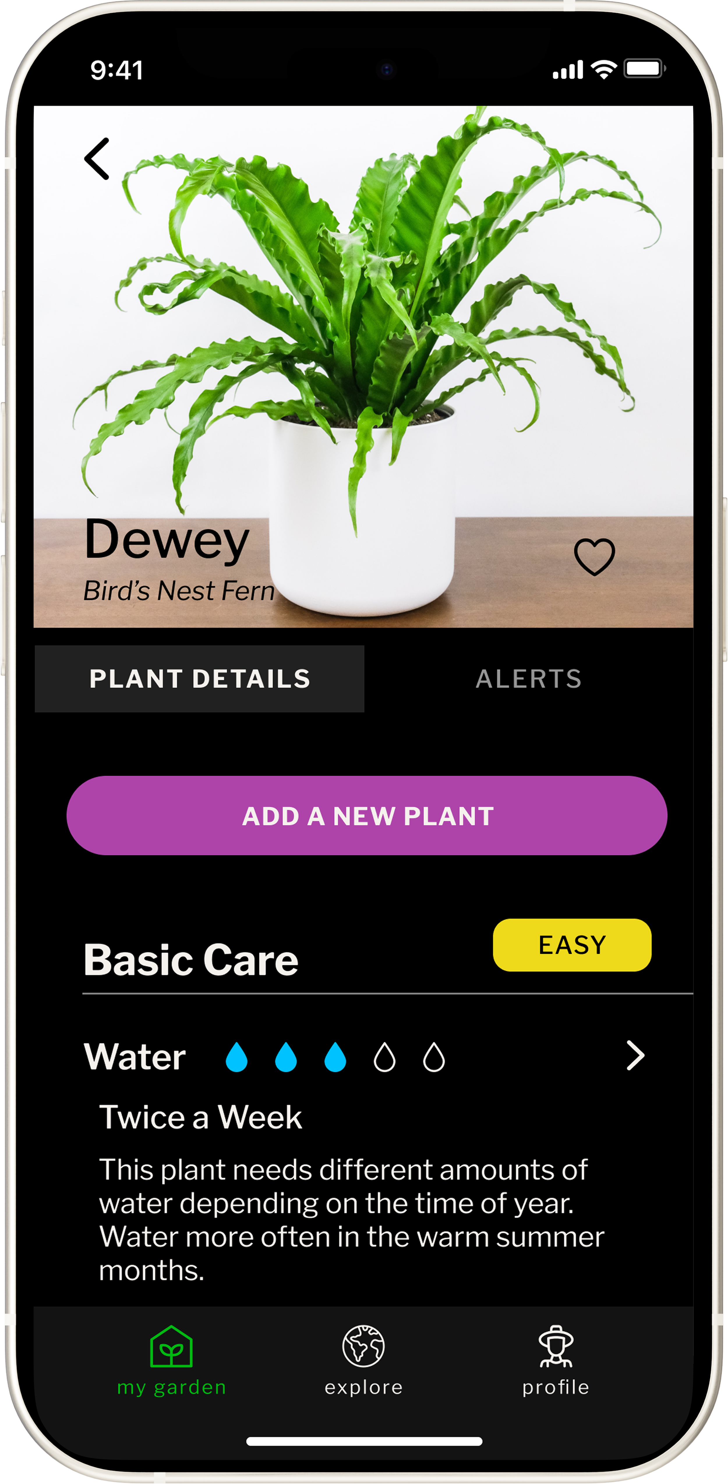
03 / REVEAL DEPTH ON DEMAND
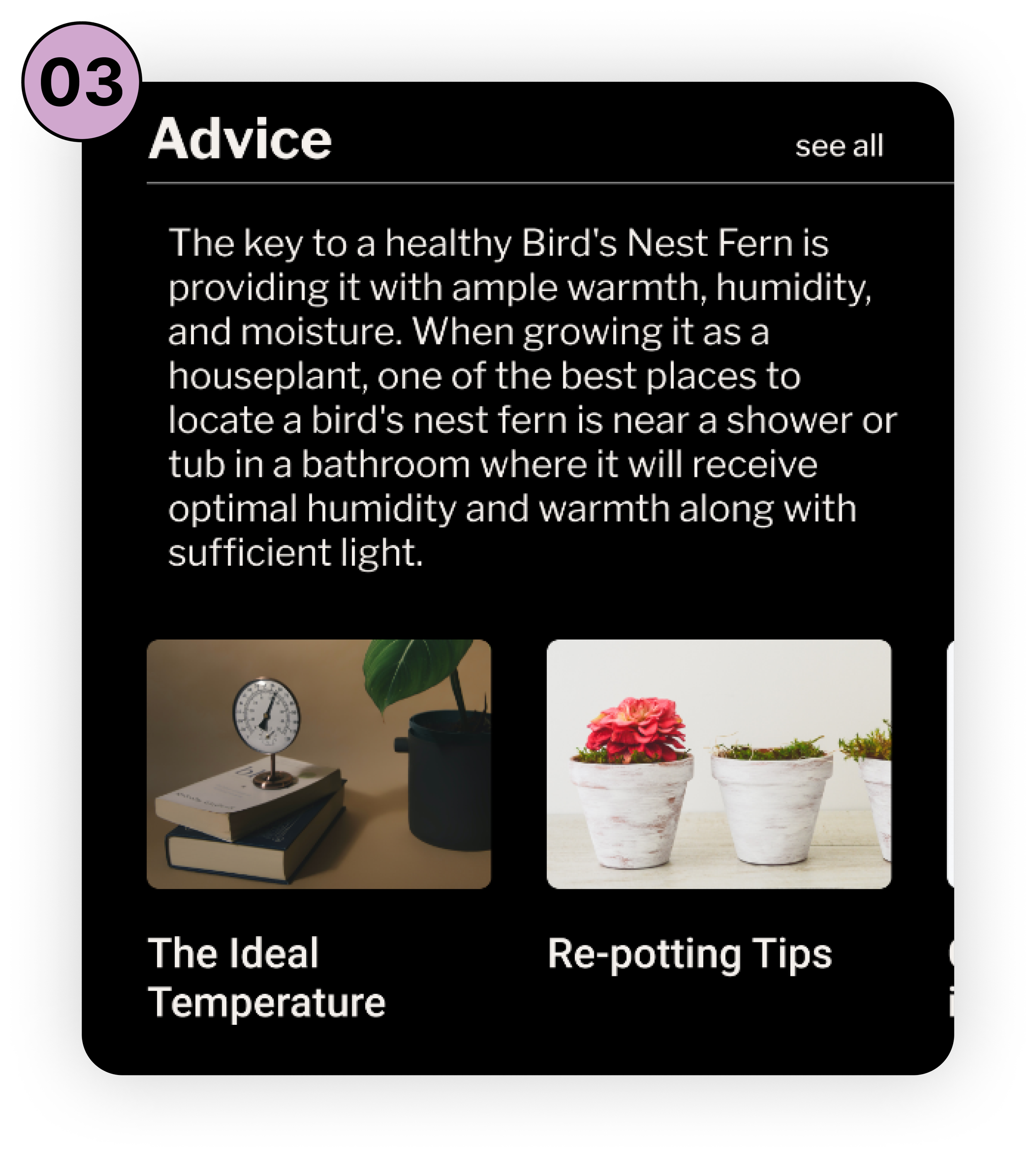
Make more detailed explanations available when someone wants them, without forcing that complexity into the first view.
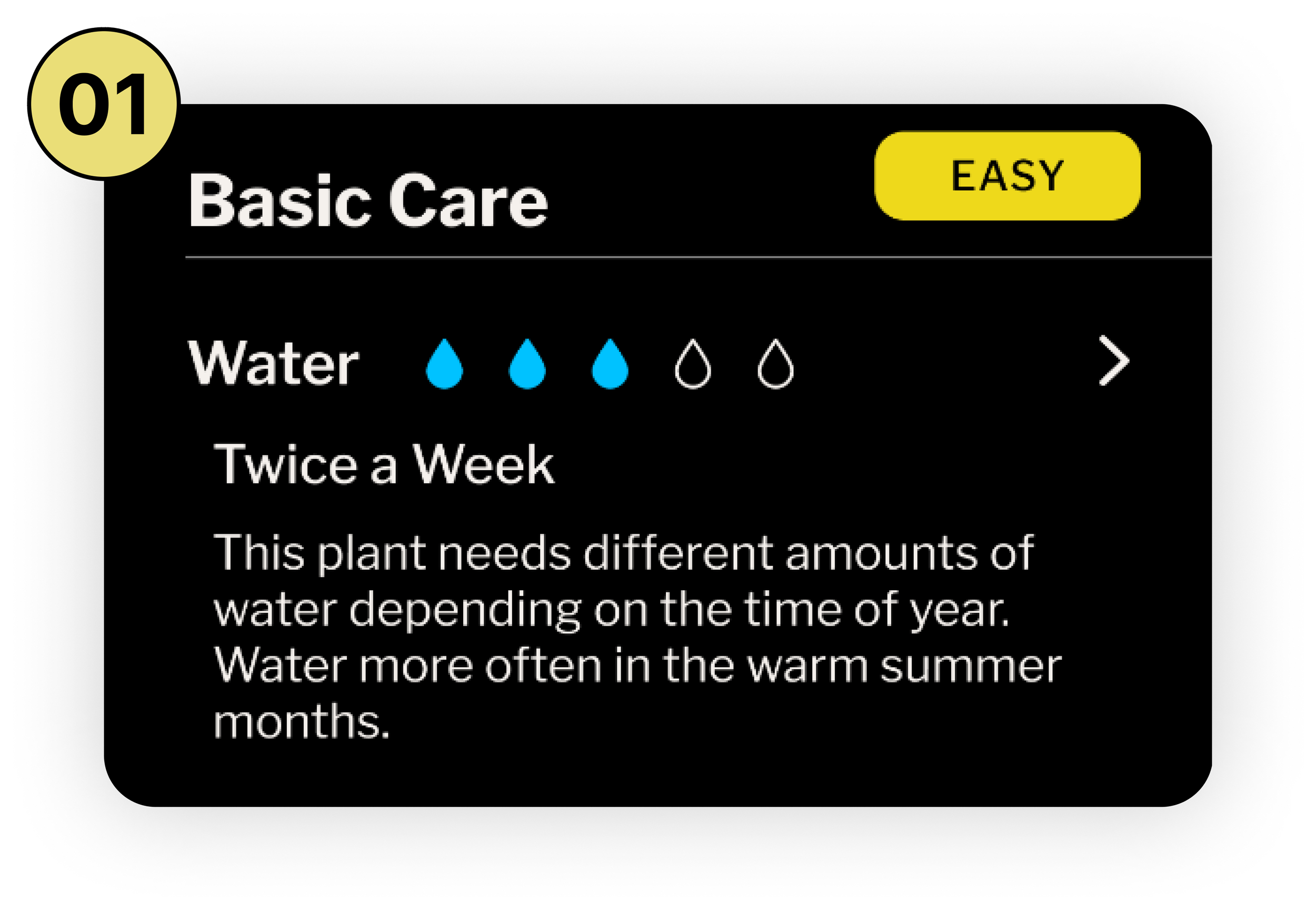
02 / KEEP CARE SCANNABLE
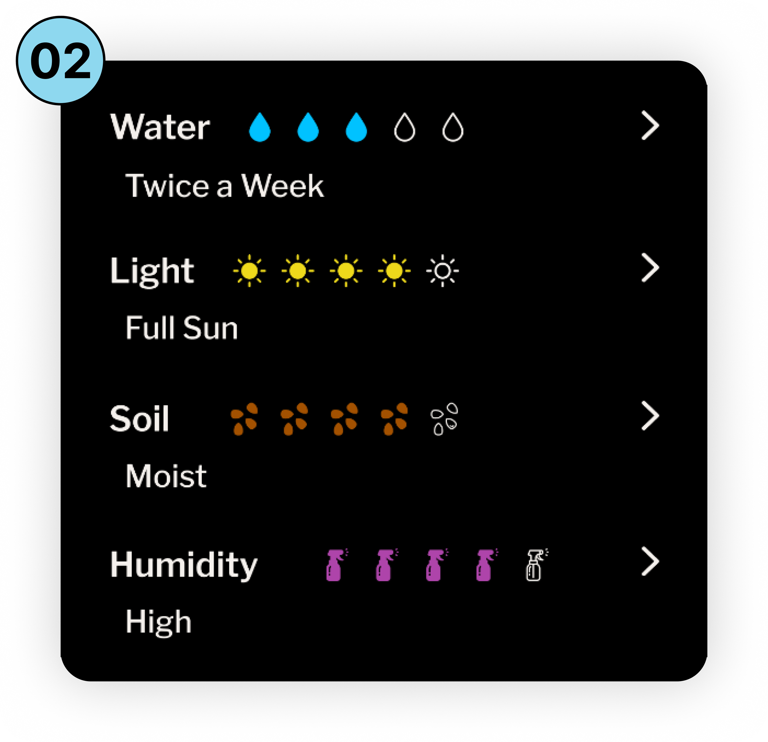
Organize guidance into clear categories like water, light, humidity, and soil so people can quickly find what matters.
01 / ANSWER THE NEXT QUESTION
Lead with the immediate action a person needs to take, not every fact they could learn.
01 / ANSWER THE NEXT QUESTION
Lead with the immediate action a person needs to take, not every fact they could learn.
02 / KEEP CARE SCANNABLE
Organize guidance into clear categories like water, light, humidity, and soil so people can quickly find what matters.
03 / REVEAL DEPTH ON DEMAND
Make more detailed explanations available when someone wants them, without forcing that complexity into the first view.
TEST + REFINE THE EXPERIENCE
Two rounds of usability testing shifted the work from validating screens to resolving moments of hesitation. I asked people to add a plant from a photo, review a care schedule, and find fertilizer guidance. Their behavior exposed the details that made the experience feel more or less obvious.
The last mile came from watching people use it.
01 / MAKE TASKS RECOGNIZABLE
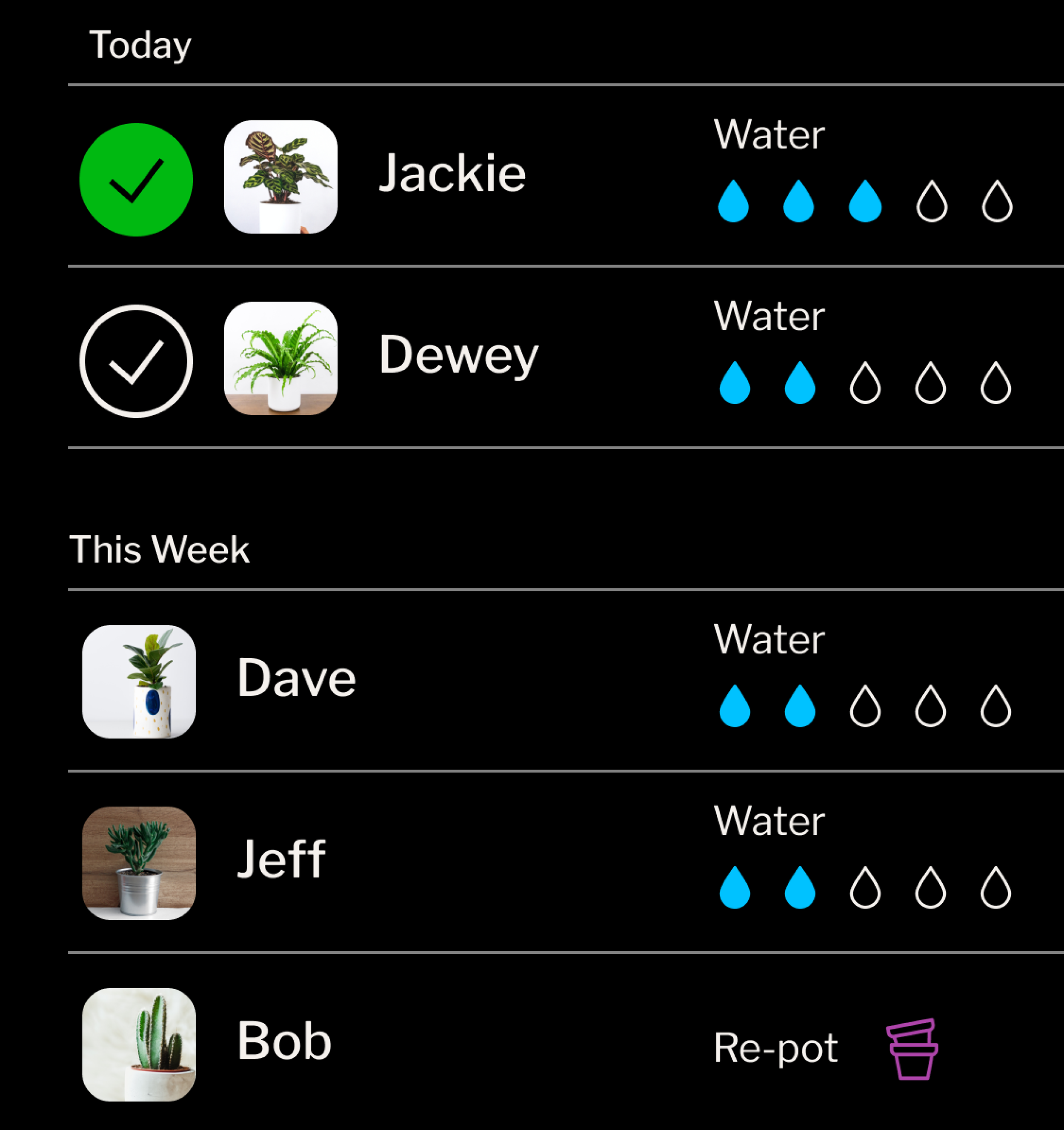
Show the plant, not just the care task.
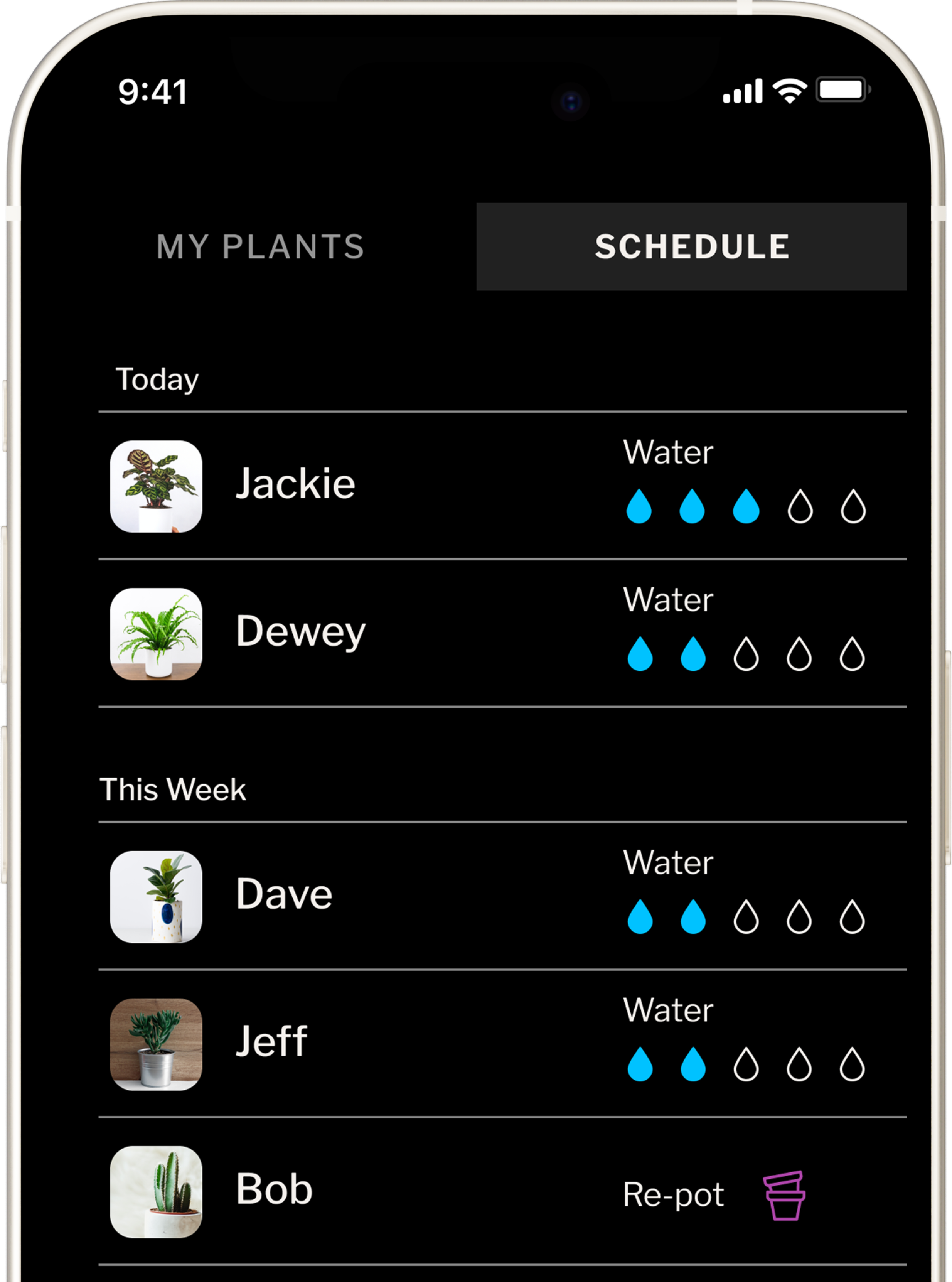
Participants wanted a plant photo alongside its name instead of a generic care icon. I changed the task treatment so people could recognize what they were caring for before deciding what to do.
BEFORE / GENERIC ICON
Hard to identify quickly
AFTER / PLANT PHOTO
Easy to recognize instantly
02 / MAKE COMPLETION VISIBLE
Let people complete care in the way they expect.
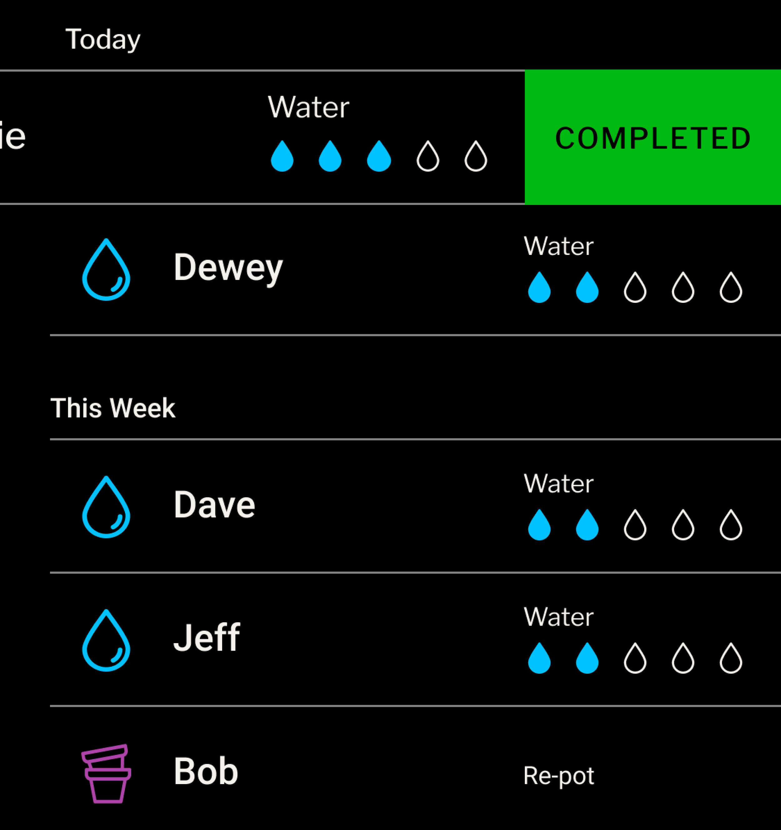
Participants did not naturally discover the swipe gesture used to complete a task. Replacing it with a visible checkmark made the action obvious and clearly showed when care was complete, while keeping the rest of the schedule in view.
BEFORE / HIDDEN GESTURE
Swipe left to reveal completion
AFTER / VISIBLE CHECKMARK
Tap to complete
03 / KEEP THE NEXT STEP OPTIONAL
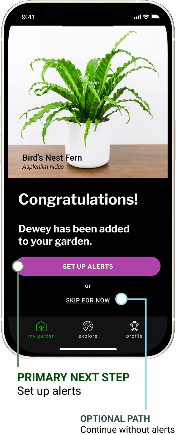
Make the next step clear, not mandatory.
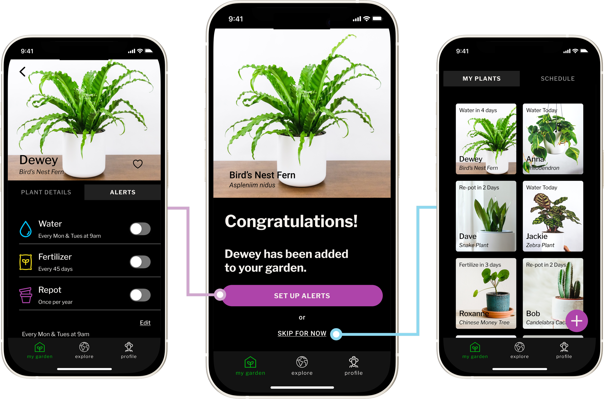
After adding a plant, alert setup was the recommended next step, but not every person was ready to configure reminders immediately. The success state needed to confirm the plant had been added, offer alert setup, and make it equally clear that they could continue without it.
A calmer way to care for the plants people bring home.
FINAL EXPERIENCE
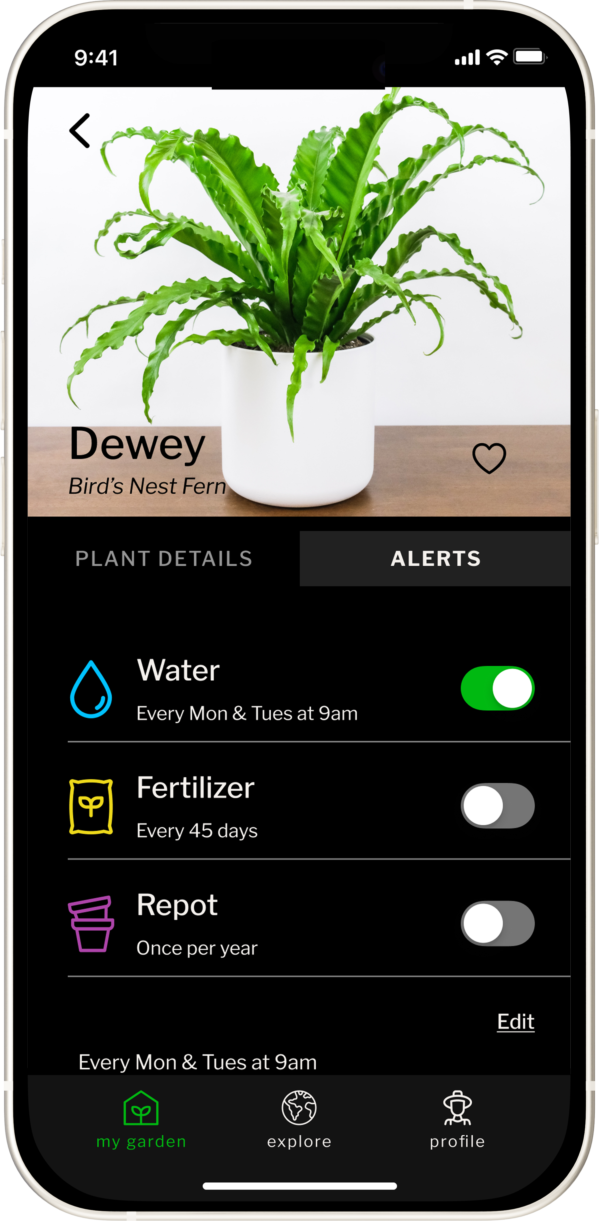
Green Thumb brings identification, personalization, care guidance, and daily action into one experience built around the plants a person actually owns. The final product helps people move from uncertainty to a clear next step, without asking them to become plant experts first.
01 START A GARDEN
02 CARE FOR WHAT YOU OWN
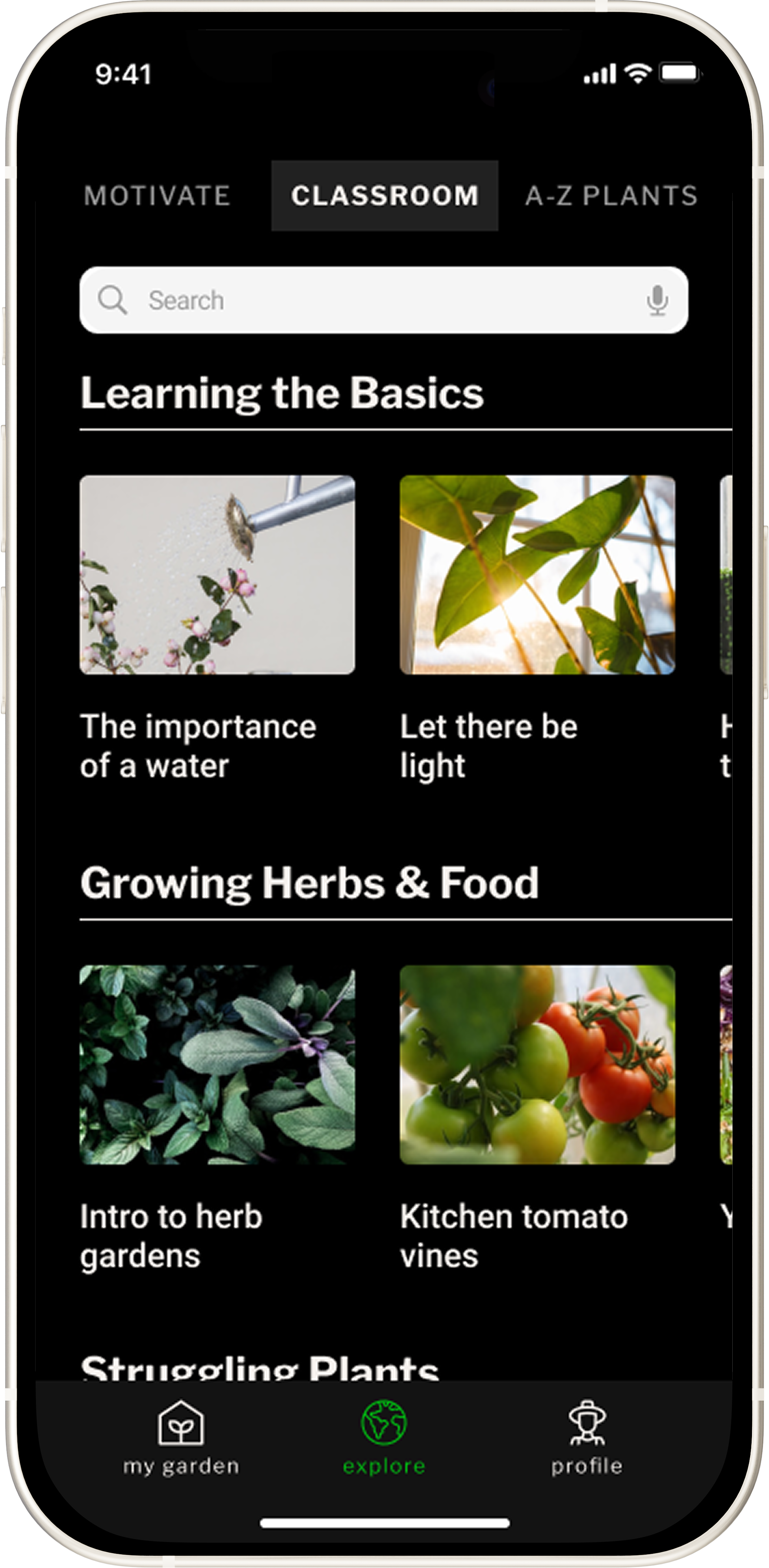
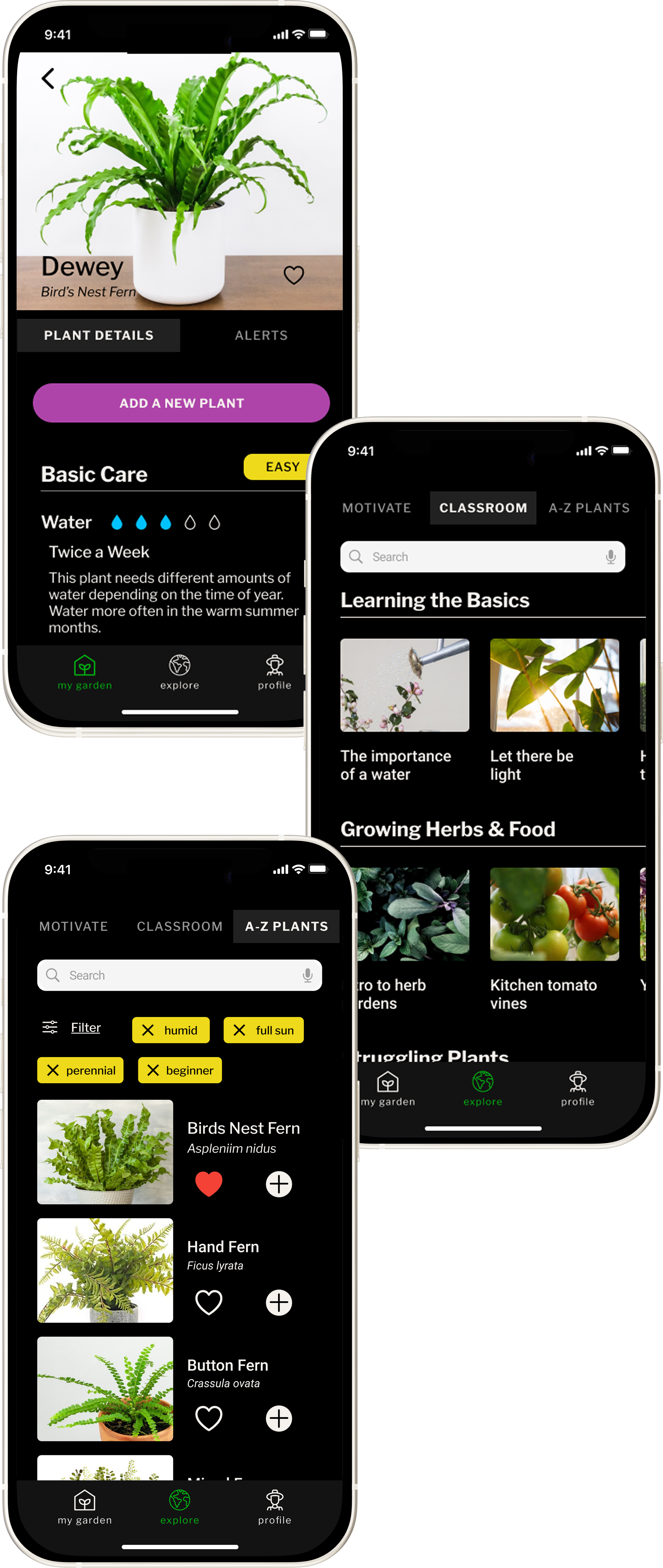
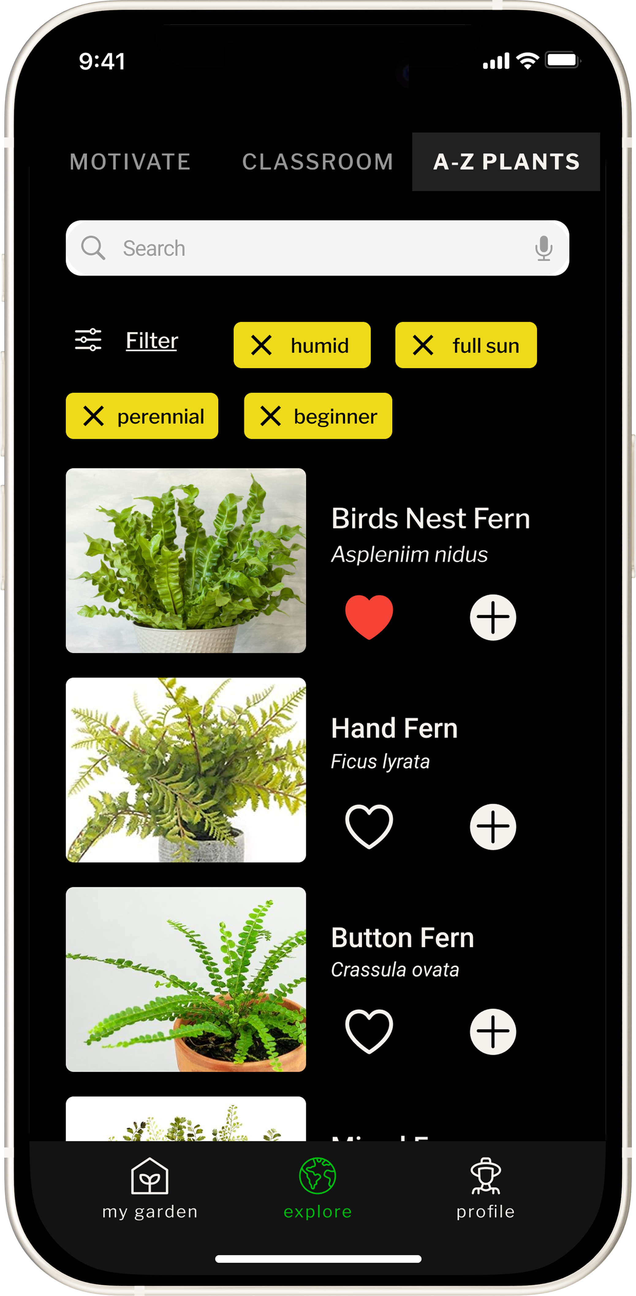
03 KEEP GROWING
REFLECTION
Designing for beginners means designing for uncertainty.
Green Thumb reinforced that people do not need to understand everything before they can begin. The most useful product decisions reduced pressure, made the next step clearer, and kept deeper information available without making it mandatory. That balance between guidance and autonomy is something I would carry into any product built for people who are still learning as they go.
identification
→
personalization
→
ownership
→
care guidance
→
daily action
→
continued learning
→
identification → personalization → ownership → care guidance → daily action → continued learning →